Friday, April 5, 2013

Optional HTML, good idea?

B
ack along the trail I was following in my post on carousels and web design firms I stumbled across Google's HTML and CSS Style Guide. This is, of course, just one resource in a sea of options, and as the name suggests, "more like guidelines, anyway." I found it useful to glance over to get an idea of what to do with my code once I had grasped some of the basic stuff.

The Style Guide has some helpful reminders about indentation (don't mix spaces and tabs, indent child elements), plus general etiquette (stick with the previous author's style, be consistent). The whole thing can be summed up as: optimize as much as possible, made code easy for collaborators to scan through. Somewhere halfway down the page, though, I found a section on optional HTML tags.

In all fairness, both Google and the WhatWG HTML5 spec frame this concept with "you may" and "consider" and other non-mandatory type phrasing. But I thought, hey, here's another way to be kind of minimalist, keep things tidy, not have more clutter than is really needed. And indeed, I could simply be rid of the <html>, <head>, <body> and a whole pile of closing tags. But! the traditionalist and skeptic in me took a pause and said, "Should I really mess with this right now? I haven't noticed this implemented anywhere, and my classes/research have all indicated that closing tags are the basis of a well-formed markup language. Maybe this is best left for another day."

Well ok, inner-skeptic, but I still want to learn a little more. So, some questions:

  • What exactly constitutes a valid, well-formed markup language?
A markup language (ML just for now, though not to be confused with ML, the functional programming language I just couldn't deal with) is used to annotate and describe a document. I'm not going to go into the history and fascinating variety of MLs here, so suffice to say that in this case, for HTML or XML, the markup is intended to indicate what each tagged element contains. In HTML this could be a <header> or a <section>, which provide the browser with standard elements to display and style accordingly. XML uses tags to describe content, too, but is best suited to databases (DB). Since it is used in DBs, it is particularly necessary to have both starting and ending tags and to completely conform with the DB definition or else any references to each element would just fail. Not going into that here.

So a well-formed and valid bunch of whicheverML follows all the rules in the relevant specification and passes tests like the W3C validator. Well-formed generally refers to syntax, so elements that are arranged according the rules are syntactically correct. The traditional definition of well-formed includes closing anything that has an opening tag and properly nesting elements. A valid ML also follows its Document Type Definition (DTD), a sort of grammar dictionary for how to apply the language (here's the HTML4 DTD, for example). See the W3C validator's info here.

  • How much of a difference in speed does tag omission really confer? 
There's not a ton of this out there on the surface, but again, Google has been implementing, or rather, omitting, the optional tags to decrease file size. When every bit counts, taking out even just a few characters here and there can add up to a big difference. According to the Google Developers article and video on reducing HTML document file size, this can actually result in "5-20% savings" in load time.

There's a conversation on StackOverflow from 2010 about how much of a difference this could actually make. It's hypothesized that especially at Google's size, "</body></html> is 14 characters and at 3 billion searches per day, it amounts to approximately39.12 GB of data per day ignoring compressions, or around 26 GB if we take gzipping into account." And another discussion from about the same time that goes more in depth on the whole issue

  • Are there any arguments against tag omission on the whole?
Some people argue for tag omission for readability, others argue against tag omission for readability. So either way, people will eventually stumble through your code. The best reason not to omit is probably compatibility. Some browsers might not recognize an unclosed element properly, some scripts may get confused, it really depends what the content is expected to do. It winds up being a personal choice: you can include the superfluous, or you can be hyper meticulous and make sure you are only omitting tags that can be omitted and not getting confused in the process.

  • Is this just one of those crazy, Google-is-way-ahead-of-everyone-else-again things?
Hard to say. Tag omission is out there, but most people don't need the speed that badly. The implementation status on the HTML5 spec only suggests that tag omission hasn't been tested on the latest browser builds.

Tuesday, April 2, 2013

Moving on, letting go

T
he hardest part of a project for me is deciding that it's finished. Usually it takes getting distracted by something new for me to really move on (this probably goes for some other stuff, too...) because otherwise I just can't let myself stop futzing, adjusting and perfecting. Translation: beating my head against something that just isn't making any more progress. So I have to learn to let it go, move forward.

In case you haven't been following along, in this case I'm referring to my "One Week Website" series of posts (clearly the timing didn't quite work out, but I never really expected it to). I started designing a new resume, and made great leaps of progress... until I ran into a wall attempting to make it perfectly responsive. This actually would have worked fine except that in keeping it super simple I was avoiding @media queries and pretty much everything except some basic CSS (see below).

And it was all going pretty well until I went to make a PDF. I have no idea how print formatting works, from web page to print dialog to PDF, but the margins didn't behave properly, it didn't fit on one page, and the white space looked weird instead of stylish (at least I hope the HTML version looks decent). So I reformatted a bit with those 800px min-widths on the #page-wrap and #content sections. Of course, now the #web and #general skills lists don't float and switch from side-by-side layout to being a single column, which means the 50% layout looks darn silly on mobile.

I tried using sections and header and h1-h6 instead of a flock of divs, and since this is a one use document, I just went with ids rather than classes. Feels wrong, though. At the very least, I have a resume that looks a little better than an old Word document, even if it isn't actually responsive. And! I did finally stop poking at it and just hit print.

body {font: normal 1em Times, serif;}
#page-wrap {width: 75%; margin: 5% auto; min-width: 800px;}
#me {display: inline-block; width: 100%; position: relative;}
#logoname {float: left; width: 25%; min-width: 165px;}
#logoname span span:first-of-type {color: #6C8771;}
#logoname span {color: #4D4D4D}
#contact {text-align: right; position: absolute; right: 0; bottom: 0;}
#content {width: 75%; float: right; min-width: 800px;}
#skills li {text-indent: -0.5em; padding-left: .5em;}
#web {float: left; width: 50%; clear: both;}
#general {float: left; width: 50%;}
#experience {clear: both;}
#learning li {display: inline; padding: 0 0.5em; border-left: 1px solid black;}
#learning li:last-child {border-right: 1px solid black;}

section {border-top: 1px solid black; padding-bottom: 20px;}
h1, h2, h3, h4, h5 {font-family: Baskerville, Palantino, serif; border-top: 1px solid black; margin: 0; padding: 0; display: inline-block; margin-bottom: 2%;}
h1 {font-size: 2em;}
h4 {float: left; font-size: 1.17em;}
h5 {padding-top: 3px;}
a {text-decoration: none; color: black;}
a:hover {color: gray;}
ul {list-style: none; padding:0; margin: 0;}
li {margin-bottom: 1%;}
dl {padding: 0; margin: 0;}
dt {padding-bottom: 1px;}
dd {padding-bottom: 1%;}

Now I just need to figure out if I really want to make my entire resume public on the internet. My feeling is no, not one bit, but then part of the point of doing it in HTML is lost. Still, it was fun to put together, and that's more important anyway.

Friday, March 29, 2013

Memory catalog

S
ometimes, months or years later, things come back to me that I once read in some book, some article, somewhere in the wide world. If I'm very lucky, I can track the fragmented memory to the source. Maybe I remember hearing the ocean wind whistling in my ears alongside the words that have pushed to the surface of my thoughts, or perhaps the context of surrounding material has remained, a preceding essay in a collection or the experience of an online newspaper. If I'm so lucky, I can usually find the original piece and catalog it more thoroughly for the next time (thereby guaranteeing that there will be no next time).
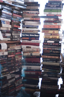
books, pile, stack, mess, bookstore, window, light, backlit, cozy

In this case, I had a thought bubble up about explaining the size of one's library to guests when they ask "So, you've read all of these?" What a silly question. It's usually posed by someone who has no library of their own, no understanding of the value of such a collection as insurance against dullness and the possibility of suddenly finding oneself with nothing to read. Sure, I have read a large number of the books on my shelves, and I keep them around as reminders of good times, comforting me with the knowledge that I absorbed something from each of them, and can easily open them up again as I please.

It's this last point that is relevant here. The book in question turned out to be A Passion for Books, appropriately enough. I brought this somewhat large paperback along on a solo bike trip last summer under the assumption that I would have time and energy left for reading after biking 60 miles a day. I did not. Nonetheless, I got through a couple of the essays and whatnot while in various B&Bs and the memory link stuck. The book, my friend, had traveled with me and formed that particular synaptical [sic!] connection while in the middle of strange lands (Western Maryland, you know) and unfamiliar furnishings.

Here now are the three passages by assorted authors from the Passion for Books collection which each mention (independently!) the arduous task of explaining one's library to unsuspecting visitors:

In the gradual growth of every student's library, he may – or may not – continue to admit literary friends and advisers; but he will be sure, sooner or later, to send for a man with a tool-chest. Sooner or later, every nook and corner will be filled with books, every window will be more or less darkened, and added shelves must be devised. He may find it hard to achieve just the arrangement he wants, but he will find it hardest of all to meet squarely that inevitable inquiry of the puzzled carpenter as he looks about him. "Have you really read all these books?" The expected answer is, "To be sure, how can you doubt it?" Yet if you asked him in turn, "Have you actually used every tool in your tool-chest?" you would very likely be told, "Not one half as yet, at least this season; I have the others by me, to use as I need them." Now if this reply can be fairly made in a simple, well-defined, distinctly limited occupation like that of a joiner, how much more inevitable it is in a pursuit which covers the whole range of thought and all the facts in the universe. The library is the author's tool-chest. He must at least learn, as he grows older, to take what he wants and to leave the rest. 
Books Unread by Thomas Wentworth Higginson (what a name)

In the two years I had been coming there, maybe two or three hundred days spent in that apartment from morning till night, I never saw anyone else there – no visitor, no delivery person, no handyman – no one. I asked Chaim about this on one of our walks (I later understood that great Yiddish writers simply do not have or permit visitors; then again, maybe it was the threat of coffee that kept everyone away), and he said something about not wanting people to think him strange for having too many books. I thought he was talking about the annoying line all book collectors endure: Have you read all of these books? I told him about Dr. Johnson's stock response: Yes, and some of them twice! Chaim stopped walking and looked at me disdainfully. "If anyone asks you if you've read all those books," he said, "it means you don't have enough books."
They Don't Call It a Mania for Nothing by Harold Rabinowitz (also the editor of Passion)

About the time of the discovery of America a book came out called The Ship of Fools, by one Sebastian Brant. In it was an attack on the book fool: a satire on the passion of collecting, in which the author said that the possession of books was but a poor substitute for learning. That phrase which the layman reader asks the book collector so often with a smirk of condescension, "So you really read them?" undoubtedly originated then. The real book collector, with suppressed murder in his heart, smiles acquiescence, assuming an apologetic air for his peculiar little hobby. His invisible armor is his knowledge, and he has been called a fool so often he glories in it. He can afford to have his little joke. So much for this threadbare gibe.
Talking of Old Books by A.S.W. Rosenbach (perhaps the most successful modern book collector of them all)

Monday, March 25, 2013

Encouraging growth (aka, pruning)

D
istinctly not my most exciting post ever: Last week, mid-March, I went about the process of pruning some of the more unruly shrubs around the yard. Today, it's snowing and there's an inch of frozen precipitation covering the buds and new shoots. Oh well? I've put together a second sheet in my spreadsheet of garden info using my favorite pruning book, the American Horticultural Society's Pruning and Training.

For the most part, pruning is about removing dead or diseased parts of the plant and encouraging growth. It's important to understand how a plant reacts to pruning in order to stimulate the growth you want. When a cut is made, the plant will react by putting energy into growing side buds on that same branch, or if you've cut back hard, by sprouting a bunch of new shoots from around the base of that cut. So, you'll want to cut back to just above a bud, so that the branch can then create a couple new branches and nice bushy growth. The book really explains this better.

The result of my tidying was a large trash bin of very prickly rose branches, yet to picked up by our wonderful local rubbish collection service. My rose bushes are tidier without dead branches cluttering up their undersides and centers (preventing light from reaching the lower branches and providing a home for mildew, bugs and other troubles), and a few of the other shrubs around the yard are less leggy and ready to fluff out with spring growth. Anyway, here's the new pruning sheet:


Next up on my list is fixing the boxwood disaster in front. I've debated between just trimming it back up into formal hedge shape and trying out some cloud pruning, but I think the former will win out. It's just so dull looking in front of the house with nothing but green hedge. If I trim up the underside enough I may be able to get some wandering jew under there, or at least a couple pots of trailing vines.

Monday, March 18, 2013

Book review: Feynman's Rainbow

hen I started reading Feynman's Rainbow, all I knew about it was that it was on my to-read stack as a result of being a recent gift, and of course the title. I mean, heck, it includes "Feynman," what could go wrong? I had forgotten the other reference point that came with it: Leonard Mlodinow was also a writer for Star Trek. This finally occurred to me somewhere later in the book when he mentions his writing hobby and desire to become a screenwriter.

Most of the memoir/biography is about Mlodinow's time at Caltech in the 1980s, when he was unsure as to his worth as a physicist (and human being, since these things tend to devolve quickly into total failure of confidence). Supposedly, Rainbow is more about Feynman than Mlodinow, hence "biography," but I found it to be more focused on the author's soul-searching and interactions with many other characters at Caltech. Sure, there are big block quotes from his conversations with Feynman, but they're more anecdotal than anything else. That makes me think that the book rides on the famous physicist's name, but survives on the actual content.

Double rainbow over Marlboro College, 2006
And it was rather compelling content, too. Perhaps that's just because I feel like I'm in a similar, confusing, in-between place where I'm not terribly confident in my abilities. Still, Mlodinow's writing was engaging and he explained the related physics in straight-forward terms, just to fill the reader in on context.

While the book's title comes from a particular section on finding what is beautiful and amazing to you and then following that sense to your life's work, I particularly appreciated this quotation from Feynman:
I have to think I have a little bit better chance than the other guys, for some reason. I know in my heart that it is likely false, and likely the particular attitude I'm taking with it was thought of by others. I don't care; I fool myself into thinking I have an extra chance. That I have something to contribute. Otherwise I may as well wait for him to do it, whoever it is. 

Tuesday, March 5, 2013

Resumes and RWD: Content, content, content

Who knew I was doing it all wrong? Throughout my working life, my resume has been horrendously unattractive, difficult to scan, uninteresting, bland, and generally makes me wonder how I've gotten as many interviews as I have. Well, no more! I recently stumbled across a couple of graphic designers' resumes and realized that a resume doesn't have to be a dry, formulaic monstrosity (mine was also much too long, a sure indicator of my lack of experience). In my own defense, I had put that resume together while working and looking at jobs in the federal government, which is really not known for being terribly stylish. But that's just an excuse.

In reading back over some previous versions of my resume (pre-Git infestation in my life, so piles of old files), I noticed that not only had I dropped some minor positions from the tail-end, but I had also lost interesting tidbits like the list of gallery shows my artwork had been displayed in. I'm not currently looking for work as a photographer, but those shows were something I was proud of and had worked hard on. Could they be considered work experience, or just an example of well-roundedness? Is character an asset better addressed in a cover-letter and/or interview?


Somewhere not too long ago I made a mental note that it was possible to write a resume in HTML, rather than the old word processor approach. Then my brain did its thing and a dim little bulb lit up; an HTML resume is a great way to show off the fact that I can create a bit of content and do some basic styling. Plus, it would get me away from the headache of nudging paragraphs and headings around in Google Drive. Complete control! mwaha– ...I've been saying that too much in these posts lately. oops.

Here's where I went slightly astray: doing a bit of background research on HTML resumes. I only meant to find a couple examples (see my collection here), but somewhere along the way ran into A List Apart (ALA)'s article on responsive resumes. Which is when I realized I had seen a retweet of this article on responsive web design (RWD) earlier in the day. Which took me back to another article from ALA on fluid layouts, flexible images, and media queries (RWD in a nutshell), further explained with handy percentage-based grid templates and some guidance on element sizing for those of us who just don't grok maths.

Somewhere in there, the best explanation for the whole business of RWD was from Mark Boulton. Instead of designing for a computer screen, an iphone, or even a printed page, designers should think in the opposite direction: from the content outwards. Start with the content, lay it out in relative terms (ems and %s), think of the whole as a fluid form originating from a single element. Design outwards from the logo, from a critical ad for your store, from a dynamically generated element like a blog post. Like all logical things, this makes perfect sense once you've heard it.

"Start designing from the content out" also makes sense in the context of "content first, then style." You can't style something that doesn't exist, and it's much more difficult to stuff your content into arbitrarily created elements. So step one is to create or define your content, step two is to style it in relative terms. A resume is also a prime place to avoid contentless content and to make sure that you are getting the right information to the user (your future employer). So to review, the most important things in design are content, content, content.

Whew, well that was sort of step one in the process. Coming up next should be editing the old resume into a more manageable sound bite, then designing a new layout before looking too closely at inspiration. That way I can get raw me onto the page before introducing outside forces.

Thursday, February 28, 2013

Career realization orchestration

T
oday I went on a whirlwind tour of small web design firms in the DC area... via their websites. I'm not entirely certain where I'll wind up working next, but I wanted to get an idea of the playing field, who does what, who has which skills and so on. A quick Google search netted me about a dozen firms to browse through, cross-referenced to some Yelp reviews and Angie's List. I realized partway through that in the longterm I want to be working on a single project, e.g. for an organization developing and maintaining a service, product, brand or mission. However, until I'm at that stage, I do want to build or contribute to as many small things as I can to get more experience in a variety of languages, platforms, aspects, tools, ad infinitum.

Anywho. Between browsing all those design firm's sites and clicking any link with the word "design," I've been all over the place lately. My favorite sites are usually minimal, clean and simple, no clutter, a touch of flashy stuff (watch the "Silver and Light" video, this guy is great), hand-drawn elements, and a limited palette (though I might also go for lightly cluttered and slightly "hipster").

EDIT: I started an account on Bo.lt, but am not entirely impressed with the service. The idea is that they archive screenshots and entire copies of webpages, hence, good for a design inspiration collection. Adding pages can be glitchy, and it still doesn't have an easy "embed collection" sort of thing. Picasa (despite having irritatingly merged with G+) does support embedded slideshows, but generates an embeddable version itself. However, I'm not actually using Boltnet for its original intended purpose.


However, I ran across a lot of sites using carousels at the top of the page, and I have to say that was a big turn off. Knowing how popular they are, I'm pretty forgiving, but good lord. If I'm disinclined to actually look at a scrolling reel of content, I can't imagine that the average user will give it any thought. And a carousel is like the A1 photo; it takes up the majority of the space above the fold, which means that space is completely wasted if no one looks at it, much less clicks on the content flying past.

All of this has been discussed and debated quite a lot across the web. The general conclusions I found are that carousels stick around because you can sort of cram more content into a single space, and because they've become a staple. The problem with reading up on this is that while every design firm and marketing agency has done their own usability testing, that data is usually kept private.

The UX site on Stack Exchange has some discussion on the effectiveness of carousels, to wit, whether rotating content nets a site any conversion (meaning the user does what the marketer is hoping they'll do: convert from just browsing to being an active user or a paying customer). I can't remember how I found this article, but it's a good, recent roundup of tidbits on banner blindness, user control and contentless content. And from there I found Jakob Nielsen's denunciation of the autoforwarding carousel (though I was disappointed to find that the main example of user testing was literally user testing. One user.)

Anyone have a good way to collect inspiration online [that isn't Pinterest]?

Thursday, February 21, 2013

What color is your flower?

few weeks ago a friend suggested that I fill out the "Flower exercise" from What Color Is Your Parachute? The exercise is designed to help you figure out what you're looking for in a career, and from what I can tell, it's also the core of Parachute (My copy is from something like 1980, and I haven't quite managed to read it). The book actually goes into quite a lot of detail on how to fill out the flower, but you can also just wing it based on the petal titles.

I know, it sounds a little hokey. I thought so too, especially since I thought I had a pretty good idea what I was looking for already, but I went with it. Turns out it's always helpful to get thoughts outside your head, whether to see all the facts in one place, leave reminders for yourself or generate new thoughts in the process. I don't want to make mine entirely public, but here are a few things I'm looking to do in my career:
  • Make information widely available and easy to access. That could be something straightforward like library work, or structuring webpages so that users can find what they're looking for plus several things they weren't. It could even be backend support for projects with this as a goal, e.g. part of a multidisciplinary team.
  • Help people become inspired to be self-motivated, informed learners who never just say "I don't know," but rather "Let's look it up."
  • Provide information services through products that are viable, upgradeable, scaleable and generally future friendly. So, no silos, relative links, transferable data, that sort of thing. 
As for skills, I have profiles on Coursera and Codecademy that will give a bit of an idea what MOOCs I've been fiddling with, and this project should also make it pretty clear what I'm capable of (anything! mwahaha*ahem). Generally: HTML, CSS, JS, some SQL and PHP, WordPress, Photoshop, Lightroom, baking, gardening... 

The other petals include things like: I'd like to work in a sunny, friendly office, with bikeability, sensible benefits, and most importantly lots of opportunity for learning and inspiration from colleagues, classes, workshops, conferences. 

And continuing with the embedding problem, here are some snippets of Parachute from Google Books in an iframe:

Wednesday, February 20, 2013

OWW: Tidying up

So, how about that acronym? It is sort of descriptive of how my brain gets to feeling after too many hours staring at the screen. Here's a post on some trouble-shooting of the last two posts, and tidying up any loose ends that I can.

First, the original list post was confused about what element tags to use for embedding HTML content. I started with embed because it sounded like what I wanted to do, but it's actually "for an external (typically non-HTML) application or interactive content." Then I found object, which "will either be treated as an image, as a nested browsing context, or as an external resource to be processed by a plugin." And finally iframe which I had really thought went the way of the dodo for some reason, and which "represents a nested browsing context." Sooo...

Second, hopefully related, the embedded HTML doesn't show up in Google Reader. By switching to object tags, I did get it to at least display alt text. Turns out this is indeed a security problem with RSS feeds.

However, problem B is that the entire embed shows up as an empty frame for at least one reader using (you guessed it) Internet Explorer (IE. Abbreviations will carry into future posts). I suspect this has something to do with cross-site restrictions/same origin policies, or possibly just content blocking. Looked up user agent switching and (yay) Chrome has a built in feature to switch user agents from the developer console. However, everything displayed just fine when I checked the blog through the IE emulators, so I dunno.

The original list has now been tidied up, streamlined, and the stray notes I had in there for my own benefit have been relegated to drafted blog posts. I probably shouldn't blow any time styling it, but it's tempting. I would at least like to standardise some nice classy, plain styling for future documentation purposes.

Also, since this entire blog ought to be transferred to my domain in the near future, I'm not sure how much will be lost in the translation, so I'm not futzing about style too much right now. I did settle on using courier bold to highlight code terms, but then discovered that the code element does the same thing, so will use that henceforth.

Oh yes, and I had intended to use some pre and code elements in my TodoList file, but they didn't display properly on the first two tries. Turns out the < and > are still interpreted as HTML, so substituting in "&lt" and "&gt" respectively was necessary. It's worth noting that all of my HTML/CSS coding is happening using only TextWrangler, having upgraded from TextEdit. Someday fancy software (especially for previewing work) would be nice, but right now I like this basic approach.

Phew. I like fixing all the little problems, but it can certainly get a bit tedious. All my librarian research skills sure are coming in handy!

Monday, February 18, 2013

Gitifying the OneWeekWebsiteList

N
ote to self: document as I go, not after the fact. It felt a lot like I was running in circles trying to find documentation and n00b help as I was working on this, so I didn't take notes along the way. A lot of the point of this first step was to familiarise myself with a few new systems (Git, GitHub, Terminal, Unix command line, Vim), as well as just publishing my strategy for creating a bigger, better website for myself. The entire project is more about learning than having a finished product (although it would be nice to sell a photo again, someday), so each post is intended as a reference for myself, as you'll note from the links peppered throughout the text below.

I apologise in advance, too, for these posts likely being very dry, incoherent and plentiful. I'm often writing from the top of my head and focusing on developing and documenting rather than fine literary prose. Coincidentally, my horoscope for today:
Once you break down a task into manageable chunks, you'll discover that your challenges are not really that hard. You are absolutely capable of meeting the goal you projected at the beginning.
Essential breakdown of Gitification of The List:
  • Wrote project todo list.
  • Thought about purpose and use of list- dynamic, changing, updating steps as I go to keep track of overall process.
  • Translated list into HTML 
  • Created GitHub repository (repo) for new project, cloned repo onto local drive
  • Updated and committed ReadMe file on GitHub
  • Discovered that this threw my local clone out of sync, figured out basics of git pull.
  • Finally figured out how to control the vim editor in Terminal (thanks largely to the patient human who helped me with basic commands) to add messages to merges and commits when I forget to use the -m option .
  • At this point, the list was basically done, and pushed to GitHub. 
  • Researched how to publish a repo to the web so that it looks like an actual page. I had seen a friend do this with a basic design portfolio, but couldn't find a simple button to push in order to see repo files in anything other than raw code. 
  • Turns out I had to create an entire new branch in my repo, move everything, and when it still didn't seem to be working, realised I had left off the obvious !DOCTYPE declaration.  Actually, I could have just left it and popped in a reference or something. oh well.
  • Had also found this Google Style Guide, which mentioned that some element tags are optional in HTML5. So I guess my dunderheadedness over formatting my initial list file wasn't actually critical, but I haven't implemented the recommendations yet. Also ran it past a W3C validator
  • Meanwhile, I just need to get the published OneWeekWebsiteList.html into my blogpost, somehow, in a way that would save me from updating said blogpost every time I modified the original file. I found the embed element in the HTML5 spec to be a simple solution. Presumably there's some way I should have done this with PHP or scripting or one of those things I don't know how to do yet.
  • So, one properly sized embed element and a div element with simple border later, the list mostly worked as dynamic content. 

Unfortunately, I couldn't discover until after publishing that the embedded HTML file doesn't display in Google Reader. It's visible in the RSS feed itself, so the problem comes somewhere in the aggregator?

I would love to hear about better solutions to this problem, as I just went for the first option I could find in the interest of moving forward. I've also just now switched to an object element, since embed seems to be intended for non-HTML content. Any thoughts?