Showing posts with label concepts. Show all posts

Monday, June 23, 2014

Getting up to speed on CSS tools

I did this backwards. It should have been mixins, Sass, Smacss, Compass, Singularity. Then again, sometimes starting and the end and working your way back lets you see the bigger picture and understand how it all fits together. Says the girl who started Drupal with core contributions.

Singularity (compass extension)- ratio-based grids (quick walkthrough video here), very easy to make different widths $grids: 1 2 3 2; Also can use px, pt. Integrates with breakpoint- add an @include breakpoint(30em){@include grid-span(2, 3);}. Very cool, super easy way to get responsive design out fast.

Mixins-  A mixin is an at-rule used to define a ruleset than can then be *reused* in other rulesets. Yay reusable code. I think mostly as a n00b I'm always surprised when things like this aren't a given- it makes perfect sense to be able to define a thing and then plug it in wherever you need that thing. But is this the same thing as the mixins Compass is using?

/* define a mixin */
@mixin .muffinstyle {
display: inline-block;
background-color: blue;
}
/* use a mixin */

p .bakery {
include: .muffinstyle;
border: 1px solid red;
}


ok, Stackoverflow question on the CSS at-rule here. So basically anything preceded by an @ is an instruction for the user agent, rather than styling rulesets. I've been using @media, @font-face and so on, but hadn't really thought about the construct itself. Here's MDN on at-rules and W3C on CSS syntax (this one's really helpful). There's a very handy graphic and description here on CSS statements and their subsets, at-rules and rulesets.

Compass- Ok, so there are CSS mixins, then there are Compass mixins... which are just a predefined set of CSS mixins? oh. And then Singularity pairs with Compass. I get it. /several hours of digging and reading later.

Sass- This also makes all kinds of sense. Things like variables to hold info in a more logical spot while you're writing, then output a fully fleshed out CSS file at the end. Saves on typing, mistakes, and again with the reusable code. Compass is for writing Sass. Got it. Wow, nesting. So logical, so tidy. Ah, and we're on the new version that uses curly braces, which seems a lot better than just indenting anyway. I do not generally approve of dropping semi-colons and such even if it *is* more minimalist.

Smacss- I really appreciate this- organizing, categorizing, approaching css in a logical fashion rather than throwing properties left and right and hoping it all works out. See my next post on approaching a problem, too. I might disagree with a couple things Snook says (and this book is a little old already), but his general point is spot on. I think this will fit into my brain even better after my next two or three tabs, too... Things start getting interesting once we drill down to the "module" level. Goals: increase semantics and decrease reliance on specific HTML

Next: More depth from Legacy CSS with Sass and SMACSS and modular SASS development using SMACSS and BEM.

In other predictable news, something here needed homebrew to install... I think it was a Ruby update. I have Ruby 1.8.7, but would like to have the current. Probably doesn't matter. But I think to update I need homebrew and homebrew last I checked needed xcode and 10.6.8 does not the xcode have. BUT. I think I can install the sass/singularity/compass package with just ruby. I hope. Later. Not now. Because this is always ridiculous, and generally why I'd rather stick with simple, low-level stuff.

Next: Creating a Drupal 8 Theme with Sass, Singularity & Breakpoint

Tuesday, April 22, 2014

Comparison of Arrays, briefly

So. Everything is an object. That was js, right? An object can be an association between a key (name) and a value. Which makes an object sort of an array, right? Because an array is a collection of key:value pairs. If key is a name, that's an object, if it's an index value, that's an array. Key:value pairs. Yep.

Examples from things I have some familiarity with:

JavaScript array creation:
var myArray = ["element1", "element2", "bunnies"];
console.log(myArray[2]);  
//prints "bunnies"


jQuery object (more than just an array):
var divs = $("div");
console.log(divs);  
//prints "[0: div.container, 1: div.logo, 2: div.content...]"


PHP:
$animals = array("dragon", "giraffe", "hedgehog");
echo $animals[2];
//displays "giraffe"


Python Lists (mutable, homogenous):
>>> colors = [['blue', 'red'], ['sage', 'vermillion']]
>>> colors[-1][0]
'sage'


And Python Dictionaries (essentially objects/associative arrays):
>>>dict = {'nonfiction': ['Pollan', 'Berners-Lee'], 'fiction': ['Tolkien', 'Asimov']}
>>> dict['nonfiction'][1]
'Berners-Lee'


And Python Tuples (immutable, heterogenous):
>>>tup = ('a', 3, -0.2)
>>>tup[1]
3


Java (fixed length):
String[] rabbits = {"fuzzy", "hoppy", "ears"};
System.out.println(rabbits[1]);
//prints "hoppy"


C (Closest to Java. Info from Learn C the Hard Way. I hadn't touched C before today, forgive me.):
main(){
char name[] = "Petunia"; 
//creates array of chars {'p', 'e', 't'...etc}
printf("name is %s.\n", name);
printf("or also %c %c %c.", name[0], name[1], name[2]);
}
//prints
name is Petunia.
or also P e t.

Wednesday, May 1, 2013

Sketchy resume design

The most important thing to me right now is keeping my perspective. If my goals aren't in clear sight, I get massive scope creep and wind up trying to learn Unix instead of just working on my HTML project (see hereabouts). However, at this stage it's also important for me to be exploring, dabbling, learning everything I can, and even when projects don't work out or seem unreasonable in some way, I do still learn something from the experience.

Take the newfangled resume I created, for instance. It didn't come out quite as responsive as I hoped, largely because of some finicky elements and my avoidance of media breakpoints. What was interesting, however, was talking to a friend who is familiar with hiring processes at a very prominent tech company. He indicated that a good looking resume is nice and all, but what's most important is a) contact info and b) recent experience. The rest is just noise.

In all fairness, programmers are not necessarily interested in shmancy presentation and part of my goal was showing web design skills. However that was pretty irrelevant when I realized I didn't really want to host my resume publicly on my website.

The process was kind of interesting. I had a basic idea what I wanted to do, drew up some rough sketches (above) with actual pencil and paper (I can't handle initial sketching on a screen, sort of like how I just can't stand e-books. I'm a holdover, I know.) Then I entered my content in an HTML document, put it into sections and got the basic structure marked up. From there it was all about CSS, I barely touched the HTML document again except to add some id attributes. Below are some screencaps of the layout along the way, shown with boxes and dotted borders so I could keep track of what element was where. I admit I went a little crazy with the colors...


And yes, I blurred them, because the text isn't the point here. Some of my original ideas were even more abstract, but it became clear that I did need to say something about what skills came from which job. I considered doing this with some sort of clever mouseover thing, where a line from skill to experience would pop up, but decided that was definitely too fussy.

Anywho, one important question that came up in the process was how relative placement communicated relationship and meaning of each element. Elements next to each other would speak to each other in some way and have some relationship. I think I may just go back to my old, boring resume (though with less hideous layout, at least).

... After all that, I'm very done with this stage. Anyone have experience with designed v. functional resumes? Does a different layout affect your opinion of identical content?

EDIT: on structure, I leaned on the HTML outline concept, but didn't include this link here, I don't think.

Friday, November 18, 2011

Books read in Chincoteague (1 of 7): Catch-22

s I finally wrapped up the last chapters of Catch-22 and went to enter this triumph in my book log, I discovered that I had begun this one not just months ago, but last November. Horrors, that I had left a book neglected for so very long, thinking that I wasn't in the mood for it, not giving it a chance. Well, to be fair, I probably wasn't in the mood for it, nor would I ever have been, but finally, on the porch swing overlooking the marsh, I at least felt comfortable enough to forge my way through the latter third of Catch-22 without going crazy myself.

Having been told by two reliable sources that this was a hilarious read, full of wit and whimsy, albeit dark whimsy, I figured I ought to at least give it a chance, read the whole damn thing and be able to reflect on it. Having done so, I'm glad I did, but the journey was one of the most depressing I've been on, stretching thin my last shreds of faith in a decent world.

Anyway, horrifyingly obtuse and, yes, hilariously conniving as Colonel Cathcart and Milo are, clearly this is a pretty good book because it did _get to me_. And I did understand Yossarian's plight, the desperation and the confusion, the fear that the world really is nuts, that this must be some deep level of punishing inferno, and the emotional grasping at what few friends could be found in the midst of war.

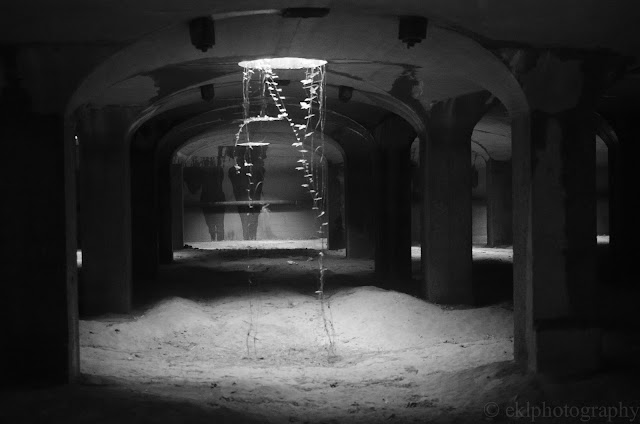
cavern, catacombs, McMillan, sand filtration, Washington, DC, underground, columns

What spun me for the greatest loop was the ending. I guess I shouldn't say here, (oh, heck: SPOILERS!) but it didn't seem in keeping with the rest of the book. In fact, I was so thrown by the ending that I felt certain I missed an important detail and Yossarian was deep into some fever dream, or was heading off for the promised land. The entire last two chapters or so took a sharp left and nearly tossed this passenger out around the curve. I suppose I'm glad it ended the way it did, with a hope for the future, an open ending and striking out for a new world. All is not lost, life goes on, "persevere."

Not sure the photo is relevant, but since I didn't have anything that really is... this underground catacomb is from an exploration of the old McMillan sand filtration site in NE DC I did with DCUrban Explorers in late October.

This review also appears in part on LibraryThing.

Friday, May 13, 2011

Junk information

books, bookstore, shelves

There's a lot that's been written lately about how much information is available to us through the internet and out in the world. It seems as though people are overstimulated and yet somehow uninspired, almost stifled by the options available. Calvin's dad once had a fit about the wide variety of peanut butters available in the grocery store. It's kind of like that. 

So there are tweets and Facebook posts at the bottom of it, meaningless snippets, but capable of sucking away half a person's day. One level up are blogs, newspaper articles (online or not) and magazines. While these are slightly more in depth discussions or examinations of a topic, a couple of pages are most often not sufficient for true thoroughness. A really well written article can, however, inspire further investigation on the part of a reader by prodding their curiosity and providing a vivid window into the subject.

Here are some bits and pieces of associated information that I've pulled together here. My favourite is a quotation from a professor Aitken, who I referenced in my thesis on childhood memory a few years ago. Aitken suggests that the best way to understand or memorize something is to love and care about it first and seek meaning in it, giving yourself context and motivation for information retention, as well as a more complex understanding of the subject through muti-layered assimilation. 

"The thing to do is to learn by heart, not because one has to, but because one loves the thing and is interested in it." -Professor Alexander Craig Aitken (Ian M.L. Hunter, “An Exceptional Memory,” In Memory Observed: Remembering in Natural Contexts, ed. Ulric Neisser (New York: Worth Publishers, 2000), 515.) 
And on the subject of tidbits versus comprehensive:
Many of us worry about a decline in deep, reflective, cover-to-cover reading. We deplore the shift to blogs, snippets, and tweets. In the case of research, we might concede that word searches have advantages, but we refuse to believe that they can lead to the kind of understanding that comes with the continuous study of an entire book. Is it true, however, that deep reading has declined, or even that it always prevailed? Studies by Kevin Sharpe, Lisa Jardine, and Anthony Grafton have proven that humanists in the 16th and 17th centuries often read discontinuously, searching for passages that could be used in the cut and thrust of rhetorical battles at court, or for nuggets of wisdom that could be copied into commonplace books and consulted out of context. - Robert Darnton, "Five myths about the 'Information Age" The Chronicle of Higher Education, April 17, 2011.
Lastly, some associated bits on multitasking, technology and focus from NYTimes and elsewhere can be found starting with this here blog post.


Photo from Capitol Hill Books, winter 2011. Not junk information?

Wednesday, February 2, 2011

Book Snark: Earth Abides

Perhaps, he felt in his mind, that was the difference! That was the difference between woman and man. She felt only in terms of the immediate, and was more interested in being able to spot her child's birthday than in all the future of civilization. Again, he felt superior. 
Earth Abides, by George R. Stewart (1949).

In fact, in reading this book about the fall of civilization, I am possessed by a great urge to preserve and protect the history of the world for posterity, just in case something should happen. If humanity vanishes for whatever reason, and/or if electricity eventually fails, what will be left? ebooks? I certainly think not. While electronic formats may be "the future," may be convenient, may be efficient, they will not last beyond the next wave of advancements. Neither will mp3 files, dvds, or all the information on the internet. In this fantastic future world, when perhaps everyone will be gone, those who are left, or those who make a galactic archaeological dig of the planet Earth may find files that are in no way compatible with their technology, or they might find vast libraries of knowledge on paper, which have only to be translated.

Earth Abides was a fantastic book, but in the end very frustrating. It became evident that it was not just the aforementioned woman who was uninterested in preserving civilization, but all of the "stolid" people who happened to survive the plague. Apparently it was beyond their capabilities or caring to teach their children how to read or write so much as basic numbers, much less entire books. Strange that in a novel about a post-apocalyptic world that was what I found most unbelievable.

The future may be defined by forward movement, but that movement should not assume complete abandonment of the past.

Saturday, November 27, 2010

Photos/Ponderings: Dichotomies

sailboats, boat show, annapolis, MD night, reflection

Perhaps, we like dissonance because it is so full of expectation for resolution.
Perhaps, we like observing other people's tribulations from within our own safe shells.

No matter how long difficult times last, there is always hope of conclusion and mending, even when it should be left behind.
No matter how implausible an ideal denouement may be, we cling to it rather than take the tougher, circuitous path forward to our eventual goal.

And when we do have to accept an undesirable outcome, when one occurs despite our efforts, we change our way of thinking so that we may say, Yes, this is what I meant to happen. It is good.

sunset, dock, bird, silhouette, chincoteague, VAPhotos are both mine from this Autumn; Top are sailboats in Annapolis Harbor during the Boat Show, the sunset is from Chincoteague Island, VA. Both will get bigger if you click on them, but please don't steal w/out credit and due publicity.

ps. It seems that my photo posts are package deals with ponderings. And alliteration.

Monday, November 8, 2010

Toothsome quotations: WASPs vs. YSL

The linguistic philosophers of France, especially the late Roland Barthes, understood how French cuisine and French culture are related, and how both fit with structuralist philosophy. A Parisian dinner is mean to be a single elegant statement, like a well-turned sentence or an outfit from Yves Saint-Laurent. The Anglo-Saxon view of a banquet can be expressed in terms of the history of the world. You begin with soup – water with things swimming in it – then move on to the aqueous kingdom, then to flying creatures, then to mammals. Finally you celebrate man in cheeses and desserts, both products of sophisticated culture. This is the diachronic view, which the French reject. They prefer to see the various courses as syntagms, or sentence components – soup adjective, fish noun, chicken adverb.

-Anthony Burgess, "The Language of Food" in Homage to Qwert Yuiop, found in The Ravenous Muse, Karen E. Gordon, ed.

Thursday, July 8, 2010

Tidbits

To say that I'm a little behind on my reading would be putting it mildly. To say that I'm a little behind on my blogging would be just plain true. So it is with great pleasure that I bring you [totally dated] noteworthy blurbs from the January 2010 issue of Wallpaper* magazine.

First off, this issue used a customized version of QR codes (example above right) to supplement the physical magazine content with online content. They called these "Augmented Reality" or "AR" graphics (below right). Unfortunately for those of us without the requisite cutting edge technology of a webcam, the idea fell a bit flat. In theory, one would find the AR graphics (little pixelated squares) throughout the magazine and hold them up to a webcam while on the appropriate Wallpaper* website and see some spiffy extras. As yours truly doesn't have a webcam to test this with, you'll just have to believe that it was awesomely augmented. QR codes are a pretty neat idea in general, but I haven't seen them catching on much in the States. I like the idea of being able to easily access information on the fly. Someday, someday we'll catch up to all these bits of the future. Someday I'll have a car that flies, dangit.

Anyway!
The interesting bits (which I summarily tore out of the issue, the better to blog about) were these:

Gapminder: From Sweden, a data toy that makes statistics about social, economic and environmental development do things like cartwheels. What makes me most happy about the service is that they neatly list where the data comes from. With 430 tidy data sets, it's a pretty handy tool for the general public. I'd be interested to hear what people who work in data services think about it.

Gapminder also offers that you can make your own visualization using Motion Chart in Google docs, and since their data is downloadable, you're free to use it. It's also the same gadget that does visualizations in Google Analytics, from the looks of it. I wanted to embed one of their graphs here, but I don't think "Trendanalyzer" will let me do it. Click through the sample image for the real thing:


And then there's Enhanced Editions: Again with the augmented, this time with plenty of peripherals added into an ebook to make the experience more, uhm, contemporary. It looks like you can alter (annotate and change the font size) your ebook on your iPhone (and only your iphone) to your desire the extent that they allow, as well as get video and audio content interspersed with the text. Personally, I don't think our short attention spans needed any encouragement. However, this is a much better use of ebooks than simply putting text on a digital screen and expecting a revolution to come through the front door carrying flags and blowing trumpets. Their premise is that everyone goes to video for their "information" these days (quotes because I don't think the greater part of youtube could be called a research repository), and this is certainly reflected in their features page. There isn't even an option to read, you have to watch the video.

Quite frankly I find that frustrating and I never watch video unless it tells a story itself (you know, movies, music videos...) because if it's informational, I can get that information much faster by scanning text. I suppose I'm old fashioned, but I just haven't got time to sit around watching video after video, no matter how short they are.

And now I can check "get that pile of stuff I've been meaning to blog about into the recycling" off my to-do list. Hoorah!

Friday, July 2, 2010

Photos, great and small

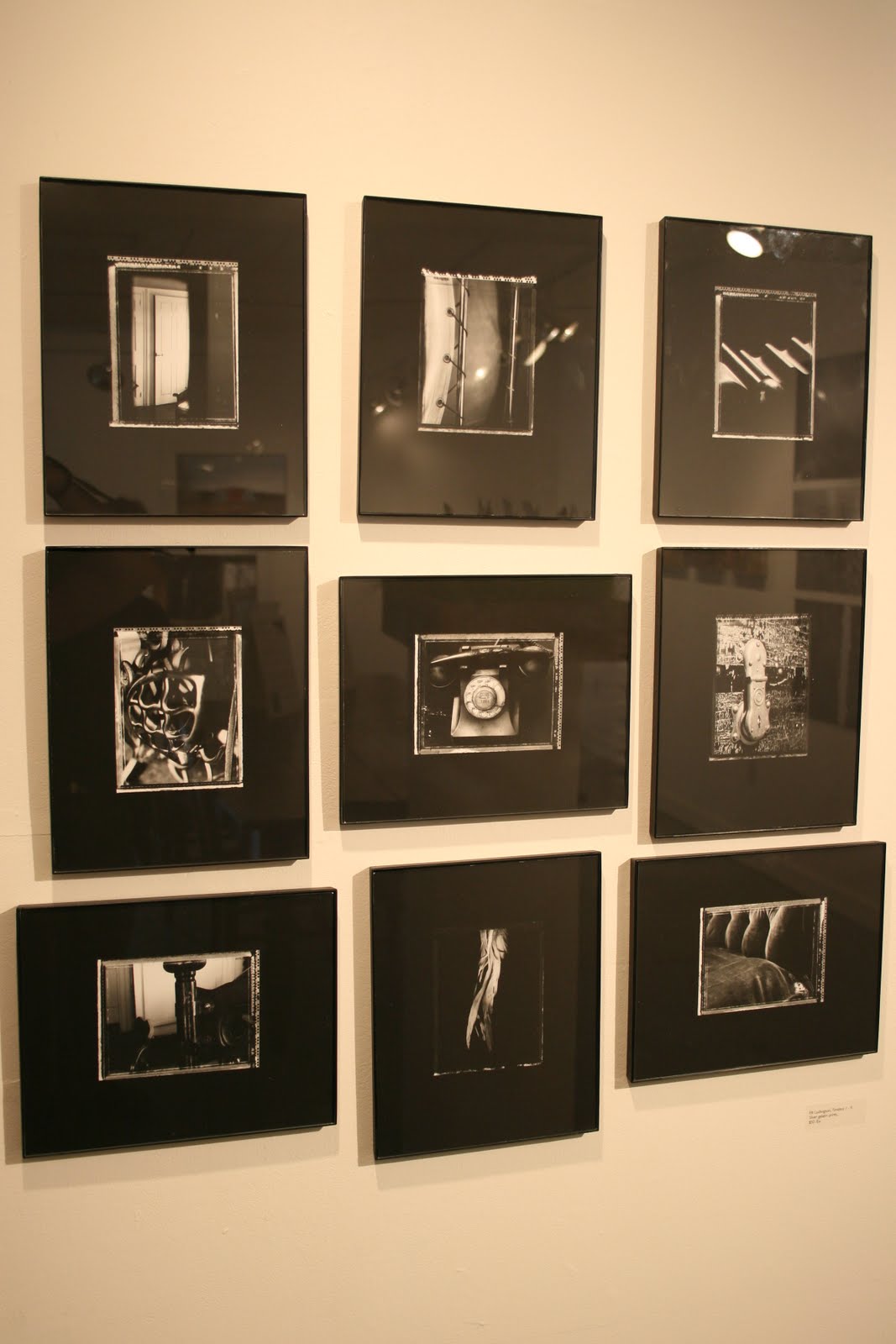
In my experience as a photographer, I have waffled between being a black and white darkroom purist and messing around with larger digital prints. The work I did in the darkroom focused on 4x5 contact prints, which felt precious and significant. Small photographs force the viewer to lean waaay in to see the details, practically putting their nose to the glass to get close enough. I like that because there's a certain amount of focus and concentration needed to view the work, and you can be more assured that your viewer will really look. I saw an exhibit a while back that really exemplified this, but of course I can't remember who or where. It was an early 20th century photographer who printed everything very small, usually 2x2 or smaller. Ideas?


This first photo is a series of prints I did mostly on location at the Whetstone Inn in VT. These nine prints hung in the Vermont Center for Photography for a month as part of a group show. It's tiny and hard to see the photos so you can't steal them, but trust me, they're really neat up close.
On the other hand, large panels of texture and colour can also pull a viewer in, but in a different way. A vast field of detail will make them feel as if they're floating away, swimming deeply in the content. The viewer is engaged in the print, but in a more meditative way, simply enjoying the patterns and colours. My interest in Rothko fits under this category.


Here's a quick example from my senior thesis show. I interspersed photos that represented memories with tight frames full of pattern or texture to explore how people observe and remember things. Unfortunately the Epson 7800 (I think) didn't print a lot bigger than this, as much as I would have loved a 5x6' print.

Anyone have good examples for either of these?

Friday, May 7, 2010

Crafty crafty

Back on April 25th, I lucked into* two tickets for the 28th Annual Smithsonian Craft Show at the National Building Museum in DC. So, with a liked-minded crafty companion in tow, I moseyed up and had a look around. *again, thanks to a certain lovely co-worker are very much due!

Unsurprisingly, there were lots of the usual things, purses, jewelry, some abstract sculpture objects, and oodles of people looking around but not buying stuff (including moi). I think just getting face time with potential future customers is valuable for the artists, especially because some of us would go home and tell our friends, or, sayforexample, blog. So here are a few of my favourites:

Locality loyalty first, there were at least two booths from Brattleboro, VT in the array:

Natalie Blake's ceramics have been on my "to buy" list for years now. She makes these spiffy little jar stoppers that look like sea anemones, and decorates her work with patterns that look like scratch-art (actually called sgraffito).


Randi Solin's Solin Glass is also captivating, full of glittering fragments. The vases have so many mosaic layers they're often at least an inch thick, and you get lost staring into them (One of these became a Christmas gift to my mom a couple years back).

Both Blake and Solin have studios in Brattleboro, VT at Cottonmill Hill, one of my favourite warehouse-gallery-studios. The Torpedo Factory in Oldtown Alexandria is similar, and a lot closer to DC, for those who want to go exploring.

In alphabetical order, then:

Ignatius Hats had sculptural, woven, straw hats of all shapes. Some looked like fools caps, one looked like a fairy cap made from leaves (above), but I just like the wide-brimmed basic hat with a tuft of feathers at the side.

Lenox Workshops presented what looked mostly like very plain, ladder back style chairs, but for some unique shaping. My favourites had legs that curved outwards and looked like they could walk away if they got tired of being sat on.


A lot of the "wearable art" said either "grandmother" or "person skinnier than me," but I really liked Starr Hagenbring's dresses. Her work was pieced together in vertical strips, making the shaping of the dress very pronounced and the skirt very full.

Shu Juan Lu displayed another example of wearable art, this one calling to my minimalist tastes. The dark fabric obscures some of the interesting folds it makes; the wool stands on its own while the knit uses the wearer for stability.

My favourite straight-up, framed-work artist was Thomas Meyers. His work bordered on similarity with Nick Bancock (Griffin and Sabine) and Peter Sis (Tibet: Through the Red Box), but was primarily reminiscent of private doodlings on odd scraps of paper.

One of the most desirable objets d'art at the show was a reddish-orange leather coat from Toshiki and Maryszka Osaki of Futari, Inc. It was shaped by wavering, raised darts around the torso, not unlike climbing vines or trails of steam rising (Meyers, whose booth was directly next door, commented that a great many people had fawned over it until they saw the price tag).

The prize for most mesmerizing piece definitely goes to Jeffrey Zachmann, whose wall-mounted kinetic art (read: marble toys) kept a full audience catatonic for at least 5 minutes apiece. The only issue I had was that the pieces required small motors to carry the marbles back to the top after each run. Each machine made different clattering, swirling noises, and altogether they overwhelmed each other. One alone might make a nice variation on the sound of an indoor fountain (there are videos on the website!).


Last but not least, more shapely weaving, this time with willow bark into baskets by Jennifer Heller Zurick. I loved how the pieces were uneven and unique, how sculptural each was and how different weaves and braids were laid on top of one another.


The only downsides to the show were that a) the booths were teeny and I felt guilty taking up space staring at things when other people wanted to look. Craft show, not gallery. and b), which is part of a, there were so many people I felt pressed to keep moving, or at least not walk straight into them. (and c) that I didn't have camera to take my own pictures of the work for posting.) I heard that the other days of the show were less crowded, so maybe next year...

Sunday, May 2, 2010

To think, to write...


Four years ago, I packed up my life and moved it all 500 miles to one small town on the top of a hill in Southern Vermont, without a damn clue what it would turn into for me. I may wax poetic about it all for years, in hindsight, in retrospect, whatever shades that might tint the memories. Everything wasn't always perfect, but the town of Marlboro felt like *home*. But before Marlboro, there was another me. A me who filled journal after journal with tiny cramped writing, drawings, designs, and lord-knows-what workings of teenage consciousness (the first image in this post is a quick view of some pages from an old journal of mine, and two books I hand-bound on the edges of the frame). Most of the writing probably isn't worth reading, but the way I lay out the text and sketches, sometimes weaving strands of text into images makes the journals visually appealing, a flip-book of nostalgia. Once I got to Marlboro I stopped writing and sketching after one journal of nothing but text. My question is, why did I stop? While I'm not prepared to completely answer that yet, here are some thoughts on the subject:

First, why did the content shift to text-only? Was it because I felt I didn't have the time to commit to more sincere creations on the pages? Because I felt my sketches and layout concepts were piddly, and not worth putting on paper? How could I be more self-conscious in college than in High School? My intent in keeping the journals was always that someday, someone would read them. Whether that would be a progeny or a historian, an alien anthropologist... Or maybe I thought they would fall into someone's hands sooner than that, and prove how awesome I was. With that in mind, I suppose the shift was because I started sharing more with people face to face at college, and didn't feel the need to record everything on paper for future transmission.

And then why did I stop writing entirely? Even at times when I could have used some introspection, I didn't write... at least not in paper journals. I began emailing, using Facebook and Twitter, recording my movements and thoughts in communications and snippets. Microblogging. This, so far as I'm concerned, is a significant step down. Maybe even a slide. Then again, I'm not sure all that introspection helped me develop much at the time, either.

I don't know if trying to restart my journaling is a mistake or not (my own version of NaNoWriMo... whatever month it may be). But if I think "nothing I do is worth recording, not the entire day, certainly" then I'm only discouraging myself. Maybe I became more private, in an odd, long-term way.

... and here I am blogging about it. Hopefully posting this will make me more inclined to journal at least once a week...

Monday, November 23, 2009

This makes me sad::

I wonder sometimes if writers read other stories in their own papers. The New York Times earlier this week published articles about veganism and the healthfullness of organic, local farming, promptly followed by an article on Saudi Arabia buying up Ethiopia for arable land. Half the time one writer elucidates a problem and suggests a solution and then another writer publishes something on a similar topic that ignores the first writer's exposé completely.

*sigh* It's just really been getting on my nerves. I may have mentioned before, but it was listening to NPR for an extended period of time that made me really acknowledge how much I want to disseminate information amongst the masses. Also known as being a librarian/information tech etc. It was the hour or two of listening to people reporting on misinformation and rumor and not covering all the points that could have been very relevant that put me over the edge. Point being, I make it my personal goal to educate as many other people about as many things as I can. Hey, a blog's not a bad place to start trying.

The entire point of this post, however, is to present the ironic juxtaposition of two articles on tonight's Washington Post (online) lead page. On the right we see a picture of some icebergs near New Zealand which have broken off of Antarctica and are threatening ships in the South Pacific. Right next to it is an article entitled "Skepticism on Global Warming: Percentage of U.S. that believes in global warming dips from 80 to 72."

...

Icebergs? anyone?* Part of me wants to be fair and say that perhaps science *is* a belief, maybe I worship the all-mighty laboratory gods instead of Allah, Zeus, Vishnu, whoever. But then my degree in biology comes over and kicks me and makes me repent my blasphemous words against the doctrine of Fact. Am I any better than a TV evangelist if I go around saying "Yes! Convert to my way! Science is truth!"? While pressuring others to take up your own beliefs is a questionable practice, the facts (cough) remain: science is tested, true and tangible, and I'll be damned if those ice caps aren't melting.

*To be fair, these things do happen as the result of local shifts in weather and temperature, and may not be linked to global warming. The irony stands.

Wednesday, July 22, 2009

Just a couple things

I was hoping I'd spend less time around my computer this week while my primary online contact is out of the country, but so far that's failed completely. This might have something to do with all the online applications I'm working on, but hey.

In any case, here's a link to Abby (the) Librarian's blog, which recently posted a giveaway of Catching Fire. It's the second part of the Hunger Games trilogy, the premise of which sounds a little silly, but apparently is completely riveting. I figure it's worth a try.

Then, I read an article that introduced me to the concept of Pierre Teilhard de Chardin’s Nöosphere. I think I had heard the word before, but not known the meaning. It's basically a "sphere of human thought", that represents humanity's development into a highly cognitive species. It's also the next step after the biosphere and geosphere concepts. The Noosphere could also be comparable to the blogosphere, the idea that everyone is connected by these ideas and ways of thinking, by the internet, for example. At Princeton, the Noosphere is being studied as a literal global consciousness that has the power to alter elements (specifically random number generation). The data seem show that if enough people are thinking about the same thing, the numbers change slightly, are less random, and deviate from the prediction.
De Chardin envisioned all this coming to resolution at the "omega point", when human thought will reach its pinnacle... and that's pretty much the end of history. What's up with Omega though? Maybe it's just me and Star Trek Voyager, where the Borg hailed Omega particles as the ultimate symbol of perfection, but I know I've seen it elsewhere and am interested in the root meanings that lead to this stuff.

Well, that should be it for now. Not a terribly coherent post, but ah well. More next time, hopefully on eco-guilt and the economy and whatever else is on my mind/reader.